A Colophon of Sorts
The Hammersmith Bridge crosses the Thames in West London, linking the boroughs of Hammersmith and Fulham and Richmond-upon-Thames. The original span, completed in 1827, was the first suspension bridge over the Thames, was damaged by a boat and replaced in the 1870s with a similar span, which has persisted to the present day as a Grade II-listed structure very much unsuited to the needs of modern vehicular traffic. Often closed for various repairs and strengthenings, it bounces noticeably as buses pass over, and during the July 2022 heat wave its chains had to be wrapped in foil and cooled with special air-conditioning to keep them from cracking. The bridge was bouncing less, I presume, at the end of 1916, when the printer T.J. Cobden-Sanderson made the first of roughly seventy short walks, from the nearby offices of the Doves Press to the center Hammersmith Bridge, over whose railing he dropped the metal type used to print his press’s renowned editions. Typographer and typeface historian Robert Green writes in his History of the Doves Type,
During its short life early last century, the Doves Press printed and bound some of the finest books ever produced in England and its approach to typography and printing subsequently exerted a major influence over book design in Europe and the United States. Many of Cobden-Sanderson’s ideas would, decades later, find expression or adaptation in both Traditionalist and Modernist circles respectively.
Perhaps most famous — or at least most-screenshotted—output of Cobden-Sanderson and his partner Emery Walker’s enterprise is the Doves Press edition of the Bible, printed in five volumes between 1903 and 1905. It’s opening page looks like this:
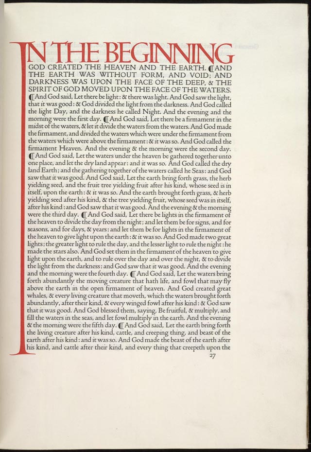 Opening lines of the Book of Genesis from the Doves Type Bible, 1903
The Doves Press was known for its singular typeface, which was commissioned by Cobden-Sanderson, who gave detailed instructions for an adaptation of the 15th-century letterforms of Venetian printers Nicolas Jenson and Jacobus Rubeus to fit his particular Arts and Crafts Movement-infused vision for an elegant artistic typeface. (Indeed, Cobden-Sanderson coined the term when in 1887 he suggested the name for the newly formed Arts and Crafts Exhibition Society.)
Drawings were created by Percy Tiffen, photo-reduced by Walker’s technicians, and handed to punch-cutter Edward Prince, who carved the letterforms onto steel bars (punches) used to strike matrices (molds) that were then filled with molten lead to cast the individual letters of type used for the printing. The Doves Type was a font in the old sense — not a typeface family containing multiple fonts sizes, weights and styles. One size only — equivalent to 16 point — no italics or small caps. Cobden-Sandersen set it tight too, with 17.25 point leading.
During its short lifespan, the Doves Press produced the Bible, works by Milton and Shakespeare, as well as a catalog of its own works, all set in Doves Type. Although Walker had ceased most involvement with the press a few years after its establishment, he still co-controlled the rights to the use of the font that they had commissioned. This worried Cobden-Sanderson, who feared that his beloved typeface would ever be subject to commercial, mechanized typesetting.
On February 9th, 1909, Cobden-Sanderson wrote in his journal:
It is my wish that the Doves Press type shall never be subjected to the use of a machine other than the human hand, in composition, or to a press pulled otherwise than by the hand and arm of man or woman; and this I will see to in my Will, though, if I forget, I desire that this which I have written shall operate in its place.
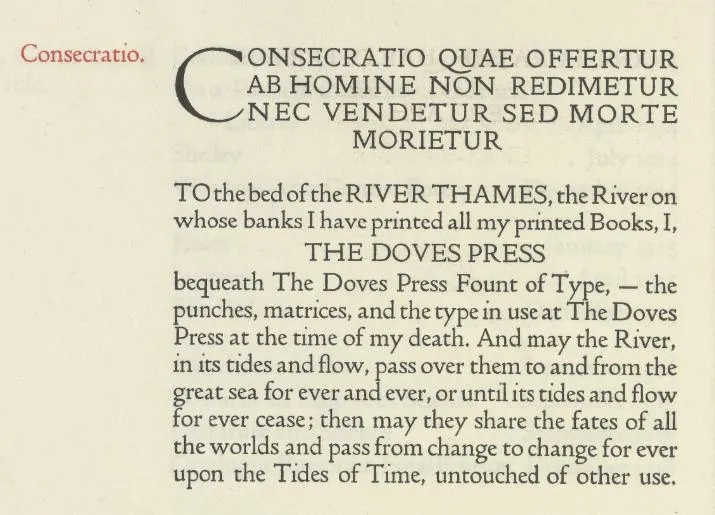
On June 11th, 1911, he wrote in his journal an astonishing expansion of that sentiment, beginning “My Last Will and Testament. To the Bed of the River Thames, the river on whose banks I have printed all my printed books …”. This Testament would be repeated, set in Doves Type, in the Doves Press’s final catalog of published works, with one important alteration: instead of being in Cobden-Sanderson’s voice, it was in the voice of the Doves Press itself:
And then he did it. On Good Friday, 1913, Cobden-Sanderson took up his pen for a progress update:
Yes; yesterday, and the day before, and Tuesday I stood on the bridge at Hammersmith and, looking towards the Press and the sun setting, threw into the Thames below me the matrices from which had been cast the Doves Press Fount of Type, itself to be cast by me, I hope, into the same great river, from the sme place, on the final closure of the Press, in ——?
With the matrices gone, no new type could be created; the Doves Press could continue using the stock at hand. But in late 1916, Cobden-Sanderson decided it was time to complete the task, making the first of roughly seventy trips to carry the leaden letterforms and drop them into the river. Robert Green writes:
By February 1917, having spent countless evenings clandestinely ‘dedicating and consecrating’ the type to the River Thames, 76 year-old Cobden-Sanderson had thrown more than a ton of lead type over Hammersmith Bridge.
The font was gone, except not really. The printed books still existed, of course, and in the ensuing decades, mudlarkers — participants in the particularly Londonian hobby of scouring the banks of the Thames at low tide to see what artifacts (Roman coins, Elizabethan pipestems, unexploded Nazi ordinance) might show up in the muck. Downstream from the Hammersmith Bridge, from time to time little bits of type would be found.
This is where Green got involved, finding some bits himself and then coordinating an authorized two-day dive which recovered more than 150 pieces. Green used these (along with, of course, many scans and examinations of original Doves Press output) to inform a new digital version of Doves Type, which he licenses sells through typespec.
Press outlets, from the BBC to the Economist, have picked up on the story and I think I first read about it on kottke.org. I was fascinated by it as well, as a story of multilayered artistic commitment verging on madness. Who would go to all that trouble to drown a typeface? Who would go to even more trouble to dredge it back up and resurrect it?
There are at least as many layers of irony, too: Cobden-Sanderson’s fear that Doves Type would be tainted by mechanized processes when, of course, its own existence relied to some extent on them: photoreduction and other high-tech processes were used to create the initial typeface, and of course the whole aspect of printing with a press is just a different era’s over-mechanization.
Similarly, the quixotic commitment involved in the quite literal digital revival of Doves Type involves celebrating an artist’s greatest work in a way that makes possible the exact thing (mechanical reproduction outside of his control) that Cobden-Sanderson worked so hard to avoid.
It’s a repeat of the lesson that first hit home with me in the story of Philadelphia’s Barnes Foundation, as told in the documentary _The Art of the Steal*: The dead may have their say, but they can’t have it for long.
This past November, I had a chance to spend a few days in London with my eight-year-old son in tow. One night we rode the Tube out to Hammersmith and walked down to the bridge. We stood at the railing and watched the lights dance in the water below, and felt the structure shudder and sway as the buses went by, and imagined Cobden-Sanderson’s seventy trips to that spot, to complete his great work. Then we walked a block to the Dove, the storied pub that gave the Doves Press its name, and then a few blocks south to catch a Fulham game at Craven Cottage.
Early this year, when I set in earnest to resurrect my old blog and give it a new form, I thought a lot about the story of Doves Type, and about the other old technologies of printing that have metaphoric echoes in the age of large language models. I decided to license the digital Doves Type for my own new efforts — fully aware that however horrified Cobden-Sanderson might have been about a steam-operated printing press, surely the idea of an LLM would have mortified him even more.
(I even tried feeding Google’s NotebookLM the text of Cobden-Sanderson’s journal, and telling the AI to create a playable text game where I could visit Cobden-Sanderson in his office at the Doves Press to quiz him about his ideas. Like so many AI things, it worked astonishingly well at first, before quickly collapsing into a pile of cliches and platitudes. I tried to coax the AI Cobden-Sanderson to go with me to take a swim in the Thames, but the game demurred, citing pollution. But yes, “he” was mortified while still being defensive of the amount of mechanical automation that was OK.)
But anyway, here we are, reading this in Doves Type (except the italics, of which there were none in the Doves Press output; I went with a size-matched Garamond for these.) There we have it: creation, destruction, loss, irony, and a question mark (this?) that looks so odd I spent no small amount of time trying to figure out where the computer had cut it off.